Composition
Composition is basically what makes a picture “look right,” or as a smart professional would put it, “composition means the distribution and placement of forms, shapes, colors, and values to produce a unified and harmonious whole.”
“Once the basic size and proportion of the picture are decided, a whole series of decisions must be made. Right at the outset, if you hope to present a realistic picture, you must determine the point of view of the scene. Next you establish the size and scale of the most important elements…Because we live and operate in a three-dimensional world we are prone to see, within the limits of a flat surface, illusionary implications of depth and space. Such illusions are fundamental to creating a believable picture. Scale and size of relationships of elements within the picture, overlapping, and use of values and color are crucial to this process.” Fritz Henning, Concept and Composition
Let’s have a look at some object placement schemes that are generally considered to be good ideas:

(image photographed out of Concept and Composition)

Composition is particularly important to a comic because it doesn’t just helps us parse what is happening — it ensures that we read the scene in the correct order and focus on what is necessary for us to notice in order to understand the story. However, the comic book artist has some unique considerations. He or she does have to make sure the image in a panel has good composition, but he or she must also consider the composition of the entire page, which is made up of several panels stacked together. For everything to work, the artist must also direct the flow of the reader’s eye. In this entry I’ll be discussing how flow clarifies the sequence of events in a comic and directs the reader to the next important element, but the artist can also deliberately create a certain flow in order to manipulate the reader’s perception of the passage of time. That topic, however, will be discussed in part three.
With that in mind, let’s have a look at some stuff from Dragonball chapter 30.

This panel has some features that you’ll see Toriyama use a lot. Notice how the background elements all point you to where you need to go. Objects that touch the border of a painting or panel or that have a tangent line tend to draw attention to themselves (and often slide the eye off the image). This is bad when done unintentionally, but it can be very useful when used correctly. The smoke from the volcano takes you to the horizon line and straight into Roshi. The rolling hills take you from Roshi to the palm tree, and then straight down to Krillin. The sloped roof of the house and its foundation then carry you right off the page in the direction of the panel sequence.
A comic book artist also has the advantage of using word balloons — you can use their tails to literally point at things you want the reader to see. You’ll often see that a drawing element doesn’t point to a balloon, but the eye will go there anyway to read the dialog, and then the balloon itself will point to the next element.
Of note here, you will notice in this panel and several others that Toriyama uses Goku’s hair to point to the next element in sequence. In fact his hair can get some slightly different curves just to serve this purpose.

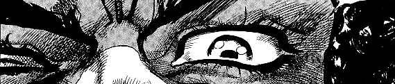
When an object is smack dab in the middle of an image or a composition is symmetrical, all of the elements surrounding the center point are given equal importance and weight. Here in panel one, Roshi’s face is clearly the focus and nothing else in the panel particularly matters. Interestingly there are still some background elements, all of which point to Roshi as the central figure, even though Toriyama could have gotten away with not including any background elements at all.
In panel two, the curves of Roshi’s body (the fact that he’s facing left) guide our eyes leftward.
In panel 3 I want to draw your attention to the fact that the panel can be split in half without dividing any art. In paintings this is a big no-no because being able to draw a straight line uninterrupted through the important elements of a painting basically means there’s a gutter that draws the viewer’s eye right out of the painting (bad.) However this is not necessarily a bad thing here, since it takes the eye down in the direction it ought to be traveling in in order to keep reading. You’ll notice also that Roshi’s back slopes to his speech bubble but his straight front-side also takes the reader down. Goku’s speech bubble also points straight down, so you see him as you go down. Also notice how Roshi dominates this panel. He occupies more space both literally and in the sense that he’s the dominant character of this scene.
In panel four we have more clever use of scenery and Goku’s hair. Notice also how Goku’s body points to Krillin! Toriyama has basically intentionally created a “gutter” of blank space here to draw your eye to the next element. The palm tree then ensures that the first thing you eye goes over in panel five is Roshi’s dialog.
Panel five is quite powerful, drawing us straight to Roshi again. He’s practically star-shaped here.
Panel six has something interesting going on. It essentially has two separate focal points, like two paintings stuck together. What’s going on here is that all of this is in the same panel to show Goku and Krillin looking on as Roshi jogs away, but Roshi and the boys have equal importance. Krillin and Goku are grouped because neither is more dominant than the other (thematically speaking). I’ll discuss more in my post about the passage of time as communicated by comics, but we’re supposed to parse this as Roshi beginning to run as one beat, and then the boys’ reaction as another beat. Weirdly enough if these were two separate panels, this would read as a faster, more simultaneous event.
Here’s an example just to show I’m not making this up:


Now that I’ve discussed my markup, you can probably see what I’m getting at here without too much commentary. I do want to point how how Toriyama very cleverly uses roads in panel 3 to form gutters to guide the eye. The road that goes toward the sea is visually blocked, whereas the road going off-panel to the left is not. Also note the use of Goku’s hair in panel 6 to direct you off-page.


And so on.
Note in the last panel where Goku talks to Roshi that the smoke rings prevent there from being a gutter straight down the middle of the page. Characterization + composition. Toriyama’s fuckin’ awesome.
Synthesis: Superman/Batman
Bad Seafood: “Obviously I don’t have the same eye for these things as you – even with your assistance, reading the “Flow” still kind of escapes me – you were plenty clear, it’s more just a the way I read comics… Rather than allowing my eyes to trace individual objects within a panel, I tend to view the panel itself as one giant block of information to take in all at once.”
Well, nobody consciously follows the lines I drew, “flow” is sort of a thing that you only notice when it’s missing – like you look at a page of a comic book and it’s almost like your brain is rejecting it, going “the fuck is goin’ on here?!” A page where you feel like you have to really pay attention just to figure out what’s actually happening and when. I remember I had a comic book where I only realized on a third reading that there were a few speech bubbles I missed because they were poorly placed on a cluttered page.
I do agree though that actually puzzling it out can seem unintuitive at times. I actually took a shortcut for the sake of clarity! If I were really showing the flow of the eye on the page, I would have zig-zagged up and down the word balloons! But that would have made the page so cluttered that people would start skimming instead of actually following – exactly what happens in a cluttered poorly conceived comics page.
Scott McCloud writes that every comic book artist has to wrestle with balancing clarity with intensity. This chapter doesn’t feature much intensity, so I’ll have to highlight some of his fight scenes later – but in general Toriyama leans very very heavily on the clarity side of things.
It’s a little hard to appreciate Toriyama’s blocking and composition in absence of other material, so I plugged in my external hard drive to look through my vast pirated comic book collection and this is the first issue I grabbed, so you could probably find worse if you really wanted to look. This is from an issue of Superman-Batman. The setting is that we’re watching some punchmans duke it out in an arena while the rogues gallery of Supes and Bats lurks around. I’ll start with page 17 of the issue, but I really want to discuss page 18 and page 20-21 in particular.


So we have a character yelling “down in front!” He is actually a well-known member of either Supes’ or Bats’ rogues gallery — so well known that even people who don’t read comics have heard of him. Well, I guess it is pointless to try to block it out, but the other character is Darkseid. What I want to discuss though is the 2nd panel. From careful study I have determined that the “down in front” guy shouts “Usher! This man is annoying me!” and then RIGHT after that, Darkseid shoots lasers at him, narrowly missing. However, what it looks like is that at the same time as the “usher!” shout (since he’s shouting WHILE dodging the laser) the laser travels FROM The crowd into Darkseid’s eyes. I also want to point out that the panel is super left-heavy and not well-balanced at all. So this sequence commits a number of sins – it guides our eye in the wrong order, a famous character who ordinarily has a rather recognizable silhouette just seems like a generic guy, and events that clearly happen one right after another are presented as happening simultaneously.

So this is the next page (the bottom panels of the last page where a cutaway to a different scene taking place elsewhere. You can read the whole page if you like.) – do you know what the blob in the 2nd panel is? It’s “Down In Front” guy, but what is he doing? What position is he in? Wasn’t he just in the arena seating? Where is he now? Look closely. Behind the jumble of word balloons you can see that this character is now IN the arena! So what happened to the combatants? Oh, they’re still there (helpfully pre-silhouetted for me) but where are they with respect to the location of the point of view characters?
And now…I’m not even gonna bother editing this piece of shit:

Blammo our heros teleport into the center of the arena – notice that Lex Luthor is far behind Supes in the establishing shot, but then Supes (with angry red eyes) talks to Mister Mxyzptlk (note how it’s not clear from that shot that Mxyzptlk is bald on top) and then suddenly Supes is IN FRONT of Luthor, sticking his hand into Luthor’s…robot chest? What is he breaking there? When did he get in front of Luthor? And I had to actually think about who Supes is talking to – he’s still talking to Mister Mxyzptlk but we don’t see Mxyzptlk’s distinctive hair as it’s cut by the panel border! So the previous panel with Mxyzptlk and this one show such different aspects of him that you’d have to check some other page to verify what he looks like head-on to realize it’s the same character. And then we don’t get another establishing shot so we really habe very little idea of who is where now. When did the Joker pop up? I guess he wandered over at some point off-panel. That would have been a great opportunity to show him coming over in the foreground while the characters talk in the background, since then we’d be able to see how they’re standing in relation to one another. Oh yeah and the fuck is Mxyzptlk doin’ in the bottom row there?
Well of course I can find out by reading the comic very carefully, but that’s the point. The reader shouldn’t have to read the comic very carefully or flip back and forth because they missed something.
And this was done by an industry professional. I actually toyed with doing a webcomic, but then I realized it’d be like shooting fish in a barrel.
And now the grand reveal! The “down in front” guy featured before was the Joker. Yep. The fuckin’ joker who has crazy hair, a long chin, and marfan-esque limbs. Lost in a muddled mess.
Here are the unaltered pages:

Petiso: “At first I thought the red lines in the silhouette page were added by you as visual guidelines or something, so bad…
I read lots of european and japanese comics but I’ve never liked mainstream american comics but I could not explain why, I guess it’s related to what you’re saying, the comic panels usually look like snapshots from a movie and don’t flow as naturally.”

Spiritus Nox: “Wow, that is striking. Toriyama’s silhouettes just makes those DC pages look like trash. You can basically always distinguish characters really easily – both from the background and from each other. I couldn’t even tell the Down In Front Guy was a person without outside context.”
Bad Seafood: “This actually reminds me of something.
As I mentioned in my first post in this thread, though I am only now just watching Dragon Ball for the first time, I know quite a bit about the series just through conversations with friends and general cultural osmosis. Concerning the android arc, I knew about Cell – that he existed at least – and Androids 16, 17, and 18 because it was a little hard not to. What I didn’t know up until incredibly recently (around the same time I decided to get into Dragon Ball) was that there were actually two more androids apparently nobody talked about.
“Yeah, Toriyama introduced two others who were intended to be the main threat of the arc, but his editor thought they looked dumb so he traded them up for some others.”
Curious, I decided to spoil myself a bit and go digging for an image.

First off, whoever Toriyama’s editor was,” [Toriyama’s friend and former editor, Kazuhiko Torishima] “that guy was an idiot cause these dudes look dope (though perhaps unmarketable). Secondly though, in light of everything Xibanya’s been posting, I can actually see a lot of their points about Toriyama’s proclivity towards distinct shapes and silhouettes (and even flow). Even if you scrubbed out both androids’ details, there could never be any confusion which one was which. Also, some nice composition in this pic in particular. Much more visually engaging than either 17 or 18 from the images I’ve seen.
Also also, that Darkseid panel’s utter lack of flow finally helped me grasp what you meant before. It really is one of those things you don’t notice until it’s not there.”


 Again, great poses and flow.


