Dragonball vs. Jojo’s Bizarre Adventure (Part 1)

Art Critique
The Anatomy of the Art of Dragonball Gaiden, Dragonball vs. Jojo’s Bizarre Adventure

Previously in this series we’ve discussed at length some of the reasons why the art of Dragonball is so appealing and effective. In order to highlight the different techniques Toriyama uses when making a comic, I compared the art of Dragonball with several other comics in similar genres, most of which were poorly planned and executed. Today I’m going to do something different. We’re going to compare Dragonball with another comic in a similar genre, but one whose art is equally effective and whose aesthetic and storytelling styles are different in almost every way – Jojo’s Bizarre Adventure, particularly the Stardust Crusaders arc.

La Anatomía del Arte de Dragonball: La composición

Arte

La composición es lo que hace que una imagen se vea bien, o como lo diría un profesional listo, «composición significa la distribución y colocación de formas, colores y valores para producir un todo unificado y armonioso».

Una vez que el tamaño básico y la proporción de la imagen se deciden, se debe hacer una serie de decisiones. Desde el principio, si se pretende presentar un cuadro realista, se debe determinar el punto de vista de la escena. A continuación, hay que establecer el tamaño y la escala de los elementos más importantes…Debido a que vivimos y operamos en un mundo tridimensional somos propensos a ver, dentro de los límites de una superficie plana, implicaciones ilusorias de la profundidad y el espacio. Estas ilusiones son fundamentales para la creación de una imagen creíble. Escala y tamaño de las relaciones de los elementos dentro de la imagen, superposición, y el uso de los valores y el color son cruciales para este proceso.

Fritz Henning, Concepto y composición

Vamos a ver unos esquemas de colocación de objetos que generalmente se consideran buenas:

(imagen de Concepto y composición)

Al número áureo se le llama la proporción perfecta.  La relación de 1 a 1,618 se puede repetir una y otra vez en cada rectángulo subdividido manteniendo la proporción: AC es a CB como CB es a AB.  Se suele decir que poner los mayores elementos de la imagen en estos cruces garantice una composición superior.

La composición es particularmente importante en un comic tanto porque nos ayuda comprender lo que está sucediendo como asegura que leemos la escena en el orden correcto y hace que nos fijemos en lo que es necesario notar para comprender la historia. Sin embargo, el dibujante de cómics tiene algunas consideraciones únicas. Tiene que asegurarse de que la imagen en un panel tiene una buena composición, pero también debe tener en cuenta la composición de la página entera, que se compone de varias viñetas apiladas juntas. Para que todo funcione, el artista también tiene que dirigir el flujo de los ojos del lector. En esta entrada voy a discutir cómo flujo aclara la secuencia de los acontecimientos en un cómic y dirige al lector al siguiente elemento importante.

Con esto en mente, vamos a echar un vistazo a algunas cosas de Dragonball capítulo 30.

The Anatomy of the Art of Dragonball: Conclusion

Art Critique

Roshi: One-two. Balance. Balance.
Krillin: Whup!! Waak!!
Krillin: Huhh huhh
Goku: Pant pant
Roshi: Keep it up! Walk slowly and you’ll be swallowed up by the sand!
Roshi: Careful now! You don’t want to get swept over a waterfall!
Roshi: Run!! Lose steam here and you’ll be devoured!
Boys: Waah!!
Goku: W-we’re done…finally…
Roshi: Believe me, this will get much easier as you do it every day for the next eight months.
Goku: Huhh huhh
Roshi: So…that’s all for your EARLY morning routine…now, for your MORNING routine…
Krillin: Gluk…!
Narration: So, Kame-Sen’nin’s training is tough after all! Will the “Strongest Under the Heavens” Tournament be motivation enough?!

Roshi:

Goku:

Krillin:

Here are the last of the expressions from Chapter 30. I could add commentary, but at this point I would just be repeating things I’ve already said, so I’ll let these stand on their own. This post concludes my main analysis of the techniques employed by Toriyama that make Dragonball so effective as a visual narrative. I plan to take a closer look at the fight scenes in a future post as well as use of background elements, but as of this post I have covered the foundation of what I think is needed to make a good comic.

To recap, here are the key elements that make Dragonball‘s art great:

  • Clarity – The identities and physical actions of each character are very clear.

  • Composition – Lines, shapes, word balloons, and the placement of objects are used to guide the reader’s eye through page elements in the correct order

  • Rhythm – Panel sizing and guiding elements manipulate the reader’s perception of the speed by which the story advances

  • Direction – Choosing a premise for the story and goals for the characters ensures that disparate elements form a coherent whole

I hope everyone enjoyed this overview and I hope that you will all go forth with a renewed appreciation for this incredible series.

e X: “Oh, absolutely. The stuff you posted was excellent and it will definitely be on my mind the next time I read through the manga.”

Bad Seafood: “I enjoyed the lot of them. Thanks for sharing.”

Have a question or comment?  Please let me know!  And try applying the analysis I used here to other comics you read.  You might be surprised by what you find!

The Anatomy of the Art of Dragonball: Double Duty

Writing Critique

This was right at the top of the next chapter of my effort post but then I realized it was about the dialog I talked about in the last post. Whoops. Anyway, as I’ve said in my previous posts on Toriyama’s visual storytelling style, a good writer thinks of their narrative as an argument. They have a thesis and the events of the story are their supporting arguments. In other words, they have a direction and purpose in their narrative. And if something doesn’t push the story in that direction, it should be omitted, even if in isolation it’s the greatest thing they’ve ever written. Some of the best things you ever write will end up on the cutting room floor. Truth.

Then I went ahead and said that the more an author can tell us about a character or a setting the better. The more we know, the richer and more immersive the world. More! Need more details! At first the two ideas (leave out details that don’t push the story in the direction it needs to go vs. give us as much detail as possible) seem to contradict each other. Not so! In the course of keeping the story tethered to its premise, all the tools used to do so, the characters’ physical attributes, the characters’ behavior and expressions, the characters’ dialog, the setting, can serve double or triple duty. The best writers and artists are masters of multitasking.

I’ll first show an example from the film Hot Fuzz, which in my opinion has one of the most efficient scripts ever written. That movie has zero waste. I’ll show you.

The Anatomy of the Art of Dragonball Part 4 (Continued): Essential Action

Art Critique, Writing Critique
Essential Action

If a character is in a scene, they should have one overarching “essential action” that describes what they do during the entire scene. A character can take many individual actions in a scene, but they should have only one “essential action.” This action, determined once the script is complete, informs the artist how to portray the characters. Let’s go ahead and have a look at Dragonball Chapter 30 and try to reverse-engineer the thought process that went through some of the “acting” we see.

The Anatomy of the Art of Dragonball: Deliberate Omission

Art Critique, Writing Critique
Should a character be in a panel or not?

As established in the previous entry, the decision to exclude something from a comic is just as important as the decision to include something. If it helps, think of this as similar to the sound engineer’s choices while scoring the anime on whether or not a section should have music or silence.

If we have an establishing shot where a character is in the foreground and other characters are in the background, what that means is that the character who is the focal point of that panel’s composition is aware of the presence of the background characters. By that same coin, if we have a panel where “geographically speaking” a character should be in our line of sight but has been omitted, that means that this character isn’t relevant to the foreground character’s mental state. It’s also worth noting that it’s often understood that if we have an establishing shot where a character is in the foreground and other characters are in the background, the characters who are not the focal point of the composition are not aware of the presence of the characters who are the focus.

Examples:

Background characters relevant to focus character’s mental state. Focus character irrelevant to background character’s mental state.

This is a rather common means of establishing a scene in both cinema and comics.  Here’s an example from a different comic:

Moving on:

Character who is logically in our line of sight omitted because they are irrelevant to focus character’s mental state.

Foreground characters relevant to focus character’s mental state. Focus character irrelevant to foreground character’s mental state.

Having established a basic foundation on when a character should be in a panel and when they should not, I also want to note that this choice can also depend on the artist’s style, but this principle generally holds in both manga and western comics. Regardless, once the artist knows a character is going to be in a scene, they should also start thinking about that character’s action. The artist also needs to think of the character as an actor on stage; the character will be delivering a performance through the artist’s drawings.

The Anatomy of the Art of Dragonball Part Four: “Tell, Don’t Show”?

Art Critique, Writing Critique

The following is adapted from a post that originally appeared on the Something Awful forums.

What is visual storytelling?

Toriyama, already an industry veteran by the time he began creating Dragonball, is a master of visual storytelling. What I mean by that is that Toriyama uses his art to do more than just show us what nonverbal events are happening in any given scene. The art reveals to us details about the setting we are in, the mood we should be feeling, and who the characters really are.

Forget “Show, Don’t Tell,” Remember the destination

Anyone who has ever had instruction in creative writing or who has read any kind of pop culture criticism has heard the rule “Show, Don’t Tell.” The point is that when we’re consuming some work of fiction it’s boring and not fun to have a bunch of details of supposedly interesting things spoon-fed to us when it would be more interesting to actually see those things instead. In my experience, however, this “rule” is an axiom cooked up in response to the fact that nobody likes an exposition dump, but it doesn’t do a good job of explaining why “telling” is bad.

Lajos Egri, in The Art of Dramatic Writing, points out that when you’re telling any kind of story you don’t have to know how it will end when you actually start writing it, but you HAVE to know the premise, which usually just a brief set of words that sum up the message of the story, such as “bravery leads to victory” or “selfishness leads to ruin.” Egri says that people who start writing a story without a premise are like someone who takes off running in a random direction who doesn’t know where they’re going but will decide when they get there. (He goes so far as to say they’re lunatics; clearly jogging was not all the rage in 1942 Hungary.) We like most stories to play out like a scientist proving a thesis – a story is a stand-in for real life. We want the story to say “If someone is like this in this circumstance, then the result is this.”

So to put it very simply, while you don’t have to know exactly how your story ends you have to know the purpose of your story and the direction in which it’s going. So you need to include the things that will take your audience there …and ideally? NOTHING ELSE.

But that’s crazy talk, Xibanya! How limiting! How can you say that?! Sorry, it’s true. This is one of the things that is SO hard for a beginner to creative writing to grasp. If something does not carry the audience in the direction of the premise, it has no business being in your story. Speaking as someone who has had their work of fiction accepted on the condition that severe cuts be made to it, it can be a difficult and emotional for the writer to identify what stays and what goes.

Sometimes, Tell, Don’t Show?

In fiction, what actually drives the story forward and demonstrates your premise is the cast. The setting exists to provide the circumstances that allow the characters to prove your point. Egri writes that a character must have no choice but to act in the way they do. He doesn’t mean that a character shouldn’t be faced with choices (actually most good narratives demand the character be faced with dilemmas) but that given the character’s personality and experiences, they must only behave in a way that is true to who they really are. From the audience’s point of view, we decide what a character’s personality and experiences are by observing what they do and putting it together like a puzzle.

If a character shows up and they verbally narrate their life story all at once without ever being interrupted by the main cast, that tells us that this new character is experiencing some kind of unusual inner pressure that compels them to reveal the intimate details of their life, that they don’t care who is listening, and that they’re probably so inwardly focused that they may not be in an emotional state that renders them capable of really listening to others.  This can be fine if done on purpose (ie, Forrest Gump‘s framing device) but if we suspect that this isn’t the way the author intends us to understand this character, then we’re taken out of the story because the character isn’t acting “the way they would really act.” If a character is a tough guy who doesn’t give a shit about what other people think, they will tell the other characters so – by acting like a tough guy who doesn’t give a shit about what other people think. How did he get that way? Let the reader fill in the gaps – the character probably had a rough childhood or something.

But what if you want the audience to know the character’s entire detailed life story down to very specific events? You could show it in flashback or tell it in narration, but you risk boring the reader, since if you set up the rest of your story properly, they want to find out what happens next. This generally only works if the flashback or narration is very brief and is a detail we HAVE to know but can’t have explained to us by the character themselves for some reason, like that they’re not the kind of person that would just start telling people they barely know about their tragic past. But what if you need more than just a panel or two to explain this character’s very very important backstory? If those events in the past are so important, why not start the story there (or story arc, in the case of an ongoing series)? If that’s a bad idea because that’s not where the story that actually follows your premise really begins, maybe you should reconsider including this character’s sob story.

But let’s consider the approach from a different angle.

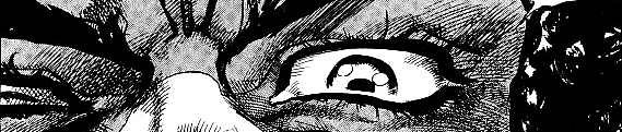
Goku is tracking down his grandfather’s four star dragonball. We know that he wants it very badly because he is trudging through a snowstorm in pursuit of it. He is eventually overwhelmed by the cold and collapses. A girl about his age finds him and takes him back to her home. The girl, named Sono, and her mother give him blankets and warm liquids and he soon recovers. They ask him why he was out in the cold and Goku explains that he’s looking for the four star dragonball. Sono becomes afraid and tells him that an army of mercenary thugs have been terrorizing their town on the pretense that they’re looking for dragonballs. The army has enslaved Sono’s father and her neighbors and is forcing them to search for the dragonballs; they have also imprisoned the village chief and will kill him if they don’t comply. After hearing this, Goku cheerfully tells the girl and her mother that he’ll take care of the problem for them.

Hey! We just “told” Sono’s sob story instead of “showing” it! I didn’t get a flashback! I feel gypped! But let’s think about this. The overarching premise of Dragonball is that a guy who is so pure-hearted that he only cares about fighting will always succeed. What is important here is not understanding the fear and pain the girl felt when her father was taken away or the anxiety she feels about what will become of the village. What’s important is seeing how the main character (Goku) reacts when confronted with this situation.

Goku actually only shows the faintest shred of sympathy and it’s not really clear that Goku is cognizant of how scared and unhappy the girl and her mother are. We make fun of movies where characters barely react to being told awful things because it shows the characters to be low-empathy weirdos (Anakin: “They’re animals and I slaughtered them like animals! Even the women and children!” Padme: “eh.” Um, Padme is supposed to be a perceptive and kindhearted person. But she doesn’t seem that concerned about the pain and guilt Anakin feels about snapping and murdering the fuck out of a bunch of people nor does she seem appalled on behalf of, you know, the people who got murdered?) but in this case Goku’s low emotional intelligence is entirely intentional. All Goku is thinking about is decking more guys in the schnoz.

Interviewer: What is Son Goku to Toriyama-sensei?
Toriyama: At any rate, I wanted him to have the sense of being that rare guy who seeks only “to become stronger than before”, so much so that it feels like “there’s no one as pure as this person”. And while he does end up saving everyone as a result of that, he himself at least has a very pure sincerity about “wanting to become stronger”. What I wanted to depict the most was the sense that he might not be a good guy at all, although he does do good things as a result.
Nozawa: A strong person like this would absolutely show off that “I’m strong”, wouldn’t they? But [Goku] would absolutely not come out with that, would he? I’m always saying this to everyone, but the world would be an incredibly nice place if it were full of people like Goku.
Toriyama: I have a feeling that the world wouldn’t operate very well. (laughs)
Nozawa: (laughs)

(from Kanzenshuu)

Sono’s a plot device and only has to have enough characterization to pass muster as an actual human instead of a cardboard cutout. Contrary to what you might think based on the Star Wars expanded universe or Tolkein’s works, that’s good. If a character forms part of your central premise, they should be real people with real emotions, wants, and needs. But if they aren’t? Fuck ’em. They’re furniture. A Potempkin village of plot. A bad writer focuses on fleshing out the complex motives of characters who don’t advance the story’s premise. Why does an intelligent woman like Mai work for Pilaf? I hate to say “who cares” because it’s fun to discuss, but as far as the plot is concerned, how realistic her motives are don’t matter because she is just an extension of Pilaf’s character. The story needed to show that Pilaf was on some level aware that his plans were not good. In real life such a person might have nagging inner doubts. As explained in a previous entry, visual storytelling requires exaggeration, so Pilaf needs minions for him to talk to.

Plot, Subplot

Wait one gosh darn minute! Toriyama gives us a visual flashback of Nam’s village! We see that his village has no water and that they’re doomed unless they get some. Why doesn’t Nam just say “I have to win so that I can get the prize money to bring water back to my village?” (Actually, he says that too.) What gives? Well while Dragonball’s premise is “a guy who is so pure-hearted that he only cares about fighting will always succeed” the Tenkaichi Budokai arc has a different but complementary premise, which I would sum up as something like “Putting all of yourself into something will give you a better result than just aiming for the material benefits of success.” Goku fights until he collapses, but he still loses the tournament. However, outside of fame and official recognition, Goku’s just as well off as if he had actually won first place – Roshi ends up spending all the prize money on Goku’s dinner, so Goku effectively won the prize anyway.

We see a parallel in Nam’s story. Nam gives it his all, but he still loses his match with Goku. But Roshi is so impressed by his pure motives and fighting spirit that he provides Nam with all the water he would have spent his prize money on. Nam too is just as well off as if he had won first place. Nam’s story is the tournamen arc’s subplot, and it’s generally a good idea to have the subplot’s premise be the same as that of the main plot, as it strengthens the premise to show that it can be applied in different contexts. We are shown flashbacks of Nam’s village because we ARE meant to empathize with Nam and understand the emotions that drive him to fight. Nam is a supporting character in the main plot, but he’s the main character in this subplot. And look at the other tournament fighters – Ranfan and Bacterian are presented as dirty (haw haw) fighters who are relying on tricks instead of skill to win. Neither of them get a particularly dignified exit.

Dual Purpose

With that in mind, more is always better. More worldbuilding! More characterization! More reveals of backstories! It makes the story feel richer and the premise more solid. But how can you cram in more when you’re not supposed to have a bunch of narration boxes full of exposition or a bunch or flashbacks or characters saying things they wouldn’t actually say? Well, nobody said you can’t do more than one thing at a time. The best way to show more is to take a character-based approach. Show us more of the world by having the characters interact with it while advancing the story. Show us more of the characters by having them dress the way their characters would choose to dress themselves and do things they would choose to do. Exclude everything else. And if you’re in a visual medium, do even more. Ideally everything in a panel or frame will not only advance the story, and reveal character, it will also provide visual pointers to direct the flow of the reader’s gaze, become part of a clear and pleasing composition, and indicate a scenes intensity and duration.

Here are the pages I reference. Sorry they’re Spanish scanslations I’m translating on the fly, I’m too lazy to scan my Viz copies.

Sono’s Sob Story

Sono: That’s a Dragonball?
Goku: It sure is!

Goku: My grandpa’s Dragonball looks like this but it has four stars.

Goku: In total there are seven Dragonballs and if you join them all you can summon Shenlong and he will grant you a wish!
Note how we get a long horizontal panel here with Shenlong in the background. We’re meant to bathe in Goku’s wonderment at how cool it is that there’s a fukkin’ dragon that grants wishes.

Sono’s mom: Now I understand! They want to use them to conquer the world! That’s why they’re so desperate for them!

Goku: According to the radar, there’s a Dragonball somewhere around here.
Sono: I get it now! That’s why my father and the rest have been working so hard just to find it.

Sono: This is terrible…The Red Ribbon Army…has forced the people of this village to work as if they were slaves.

Goku: So why doncha beat ’em up?
Sono: Impossible! They’re armed to the teeth!

Sono: In that tower they’re keeping the mayor of our village hostage. If someone dares to try to rescue him, they’ll kill him.

Goku: We’ll see about that. Time to get going!

Goku: Thanks a lot for saving my life! I’ll save your village to return the favor.
Sono/Mother: What?!

Sono: They’re adults and you’re just a kid! They’ll kill you!

RR Guy: There he is!
RR Canine: Get ‘im!

Nam’s Sob Story

Roshi: Hey! How envious you make me! Fighting against such a beautiful woman!

Roshi: What what? His eyes seem as serious as a manga character’s. He’s not playing around. I feel in him an incredible spirit, as it the tournament were of great importance to him.

Roshi: Let’s see.

Boy: Brother, I’m very thirsty.

Woman: Even the well is dry now.

Man: This isn’t good. We won’t be able to harvest anything with a sun like this. This village is finished.

Nam: In six months the wet season will come. Until then I wil go to the city to bring you all water.

Woman: But if you do that we won’t have much water left for the vegetables. There’s no way to endure two months that way.

Nam: I will enter the Tenkaichi Budokai and buy water with the prize money. The fact that the tournament is happening right now is a gift from God.

Woman: Thank you very much…but how will you get there?

Man: Nam, have this money. It’s from the entire village and I think that it will at least be enough for you to make the trip.
Nam: I promise to win and bring you all water.

Villagers: …Give it your best…Don’t worry if you lose…Fight hard…

Roshi: Now I see…

Roshi: I understand. So that’s why he’s being such an asshole.

Potsticker: “That’s clearly Jackie Chun in the Nam sequence.”

Aw shit, mixed them up again.

Mordaedil: “I found this particular part of the Toriyama interview interesting: ‘Toriyama: What I wanted to depict the most was the sense that he might not be a good guy at all, although he does do good things as a result.’ And then I recall the very last page of the whole manga, where he flies off with Uub. Even in the anime, this scene seems discordant. Nearly a bit chilling. The idea that Goku might not be such a good person as we’ve come to expect came through that scene more clearly to me than most others.”

Blue Star: “That Toriyama quote is interesting. But I don’t think it’s fair to say that Goku is some kind of sociopath or something. I think Toriyama is saying that Goku might not be “such a good guy” only in comparison to, like, Superman or something. Superman is utterly selfless (or so I’ve been lead to believe; I never got into superhero comics). Goku is pretty selfish but he’s kind-hearted and good-natured. He cares about people and has a sense of right and wrong. That good-naturedness coupled with his admittedly selfish desire to always become stronger is what makes him a hero, albeit an imperfect one.”

Thyrork: “Goku’s imperfections make for a better character.

Agreed.

The Anatomy of the Art of Dragonball: Toriyama’s Design Philosophy and New Media Comics

Art Critique

The following is adapted from a discussion on the Something Awful forums.

I was looking through translated Toriyama interviews on Kanzenshuu, and I found some good stuff from the man himself on panel size and his design principles.

With comics, there’s the aspect of how you’re actually looking at an entire spread of two pages. You’re aware of how, “this panel is bigger than this one, so it’s a more powerful scene”. So, if [digital comics] all come out with the same size panels, it might feel a bit “off”.

Kanzenshuu includes this footnote:

Toriyama’s comment pretty aptly describes the problem with modern “keitai manga“, comics formatted to fit the screen of a mobile phone.

And some more interesting comments by Toriyama on his design philosophy and background in advertising:

Wired: In drawing comics, what is your ratio of visual information to textual information?

Toriyama: Really, as far as information is concerned, the visual side is bigger.

Wired: With what stance do you view words?

Toriyama: At any rate, I don’t waste much time blathering on about useless things. As a rule, you can understand the content to a certain extent with just the pictures, and words are nothing more than a supplement to them. I had that drilled into me by my first editor, I guess you could say…. If you’re going to come out and say something, then make it something that will strengthen the characterization even further, is what I mean.

Wired: You have to choose carefully.

Toriyama: Yes, that’s right. Instead of blathering on and on, how are you going to keep it concise?

Wired: Toriyama-san, whether it be Dragon Ball or Dr. Slump, I think your works have a large number of really “stand-out” characters that are able to coexist.

Toriyama: That might be something that was fostered in me through doing advertising design. I think that the very fact that I had to draw all these different things for supermarkets and big retailers, looking back on it now, came in handy.

Wired: Without realizing it, you were learning the basics….

Toriyama: Right. Also, keeping a deadline was also something that was fostered in me at that company. (laughs)

Interview from Kanzenshuu.

LORD OF BUTT: “Comics formatted to fit mobile screens are terrible, Comixology has the right idea- reading a comic in smart view on there is remarkably similar to that gif you posted.”

Oh yeah? I’ll have to check them out, I am totally unfamiliar with digital comics because like a decade ago they were really really bad.

Prison Warden: “The big examples I can think of that have a starkly different design than print comics (ie not stuff like Onepunch-Man which is just a comic but online with occasional spreads and such) are korean Manwha like Tower of God, which are explicatly formatted for mobiles, being like a long roll of pages rather than a book. Or like, Homestuck and such but that has actual animation and such to map out the passage of time.”

I’ve never read Homestuck but I sure have heard a lot about it and recognize the zodiac critters as coming from it. I might look at Homestuck “for research purposes only”… I have seen the long roll of paper thing done really well by the likes of SMBC though. I do think that’s a good use of the medium.

LORD OF BUTT: “Yeah, Comixology is a legit good service. I read through the first two volumes of Saga on there in Smart View on my old phone and it was completely fine, no complaints whatsoever.”

Drowning Rabbit: “I would recommend Atomic Robo: Two Fisted Tales as a really good use of the digital comic medium. It’s a comic that is specifically written for digital only. It’s also a one-shot so you don’t miss out on just grabbing that one.

Granted I really enjoy Atomic Robo, but just for the way it is implemented, I like it as a experience on my iPad as well. If there are other recommendations for comics like that I’d be down for that too!  I don’t count the ones like Batman ’66 that have print versions and don’t really take advantage of the digital medium 😦 “

Just two bux? I’m there. Thanks for the recommendation!

Prison Warden: “‘might look at Homestuck for research purposes only’? What have I done

The Anatomy of the Art of Dragonball Part 3 (Continued): Time and the Toriyama

Art Critique

The following was originally posted to the Something Awful forums.

Each panel in a comic represents a length of time passing. In isolation, a single square-shaped panel with one focal point lasts some unit of time in our minds, which I will call a beat. Adding other focal points adds more beats, as does adding dialog – the more dialog, the longer the beat. Since our mind takes in a speech balloon as one unit of time, splitting dialog into more than one separate balloon lengthens the time we perceive as passing – often necessary because if a character’s balloon is a huge wall of text it seems overwhelming, like they’re rattling all that off without moving or pausing. Even so, sometimes splitting balloons isn’t enough to stop a wall of text from being dumb.

Um, so he’s just frozen there with his hand in that position the entire time he’s saying all that? Well OK.

Additionally, in comics panels that are long horizontally with relation to the width of the page are seen as lasting a greater period of time, so panels that stretch across the entire width of the page are seen as lasting the greatest amount of time. These long horizontal panels function in a similar way to a horizontal panning shot in cinema.

Panels that are very long vertically (stretching across 2/3rds or more of the height of the page) can also be seen as depicting a longer period of time than surrounding panels, but the effect is weaker and there is greater risk of confusing the reader because it can often be read that whatever is happening in the vertical panel continues to happen as the stuff in the panels to the right or left of it is happening. A long thin vertical panel is most often used to provide us a full-body shot of a character so we can admire their awesome body or costume or whatever and it’s meant to function in a similar way to a vertical pan in cinema.

It’s best used when it’s safe to assume whatever is happening in the vertical panel continues to happen during the horizontal panels that sit next to it. I personally am not a big fan because usually once you get below the waist (heh) the design isn’t that interesting and the reader’s eyes will wander away, and I’ve seen it used way too many times right next to panels where the featured character then starts doing something, which makes their vertical panel have a weird overlay effect, like I’m watching a flashback or something (in fact I’ve seen vertical panels used deliberately to take sections “out of time.”)

Probably safe to assume here that 17 continues to stand around while Piccolo clenches his fists n’ stuff.

A panel that has several focal points, especially one in which the artist has included “pointers” to force your eye to sweep in a zig-zag pattern across it, is also meant to depict a longer duration of time, and works similarly to a sequence shot in film. In a comic panel, every direction change in the sweep of your eye adds more time to the duration of the shot. This technique is generally suitable for establishing shots meant to show a chaotic scene and should be used sparingly – it’s often not easy to tell at a first glance what the reader should focus on next after absorbing each individual focal point, so if the artist relies on this too much, the reader will feel exhausted and just start skimming.

In summary, to lengthen the period of time a panel is perceived to depict:

  • Add more simultaneous events (focal points, to make the panel the equivalent of a panning shot in cinema)

  • Add speech balloons

  • Make the panel long and thin, particularly on the horizontal axis

  • Force the reader’s eye to zig-zag across the panel (not recommended for regular use)

So a panel like this is one that we would perceive as depicting a comparatively long stretch of time:

Note that it is one page width long, has three disparate elements, and also includes speech bubbles. So as we read from the right edge to the left, we read the huffing and puffing of Roshi, see Roshi, read his next huffing and puffing, see that Krillin is jogging, also huffing and puffing, Goku is jogging, yes, huffing and puffing, and then we see background elements, as if we are stationary observers and these three characters have run past us – and at the moment we observe the palm tree, they are still running (audibly so, too, since Goku’s last huff/puff trails behind him slightly.)

Let’s look at the beginning of Chapter 30, the part I skipped before.

  • We have a large establishing shot of Kame house. We absorb the house and the tree, then see the crowing rooster – we’re meant to linger here.

  • Then we get a small panel with the ringing alarm clock and another small panel of Roshi stopping the alarm clock – both panels each have just one focal point, and both are read as encapsulating very brief moments in time.

  • While the panel with Roshi getting up is about as wide as the above alarm clock panels, it reads as lasting longer. Roshi speaks, we see him sitting up and rubbing the sleep out of his eyes, and the lines in his robe ensure we look all the way down to the bottom of the panel before tracking up and seeing Krillin sleeping. Due to the placement of object in this panel, it functions as a panning shot – imagine a film scene where we see Roshi sit up and rub his eyes, then we widen the shot to include Krillin sleeping, all while Roshi continue to rub his eyes. This panel’s flow basically has a bounce in its trajectory.

  • Roshi gets dressed and talks to Krillin, then in the next panel Krillin says something and Roshi answers, also very brief. These two panels are about as wide as the previous one and include more dialog but they each read as brief and snappy because we sweep across them in a linear way without needing to double back. They do, however, read as taking more time than the alarm clock panels because they have dialog and more elements that take the focus (to be honest I think including the dangling alarm clock in the foreground of the last panel was not a great choice because the leg of the alarm clock very nearly is tangent to Krillin’s sleeve, so it seems like there’s a weird blob there at first because the alarm clock’s silhouette doesn’t stand out. If I were Toriyama I would have shifted it a bit to the left or not included it at all.

  • Roshi walks upstairs. Great use of flow pointers as the lines in this shot all point to Roshi as the focal point. Relatively brief.

  • This panel appears to last some time as our eye sweeps over it in a reverse Z pattern – from Roshi’s thought-bubble dialog to Lunch to Goku to Roshi to Roshi’s 2nd dialog. You could split this into two panels, one showing the sleeping Lunch and Goku and the other showing Roshi’s reaction. This is better though since it tells us where the characters are in relation to each other.

  • The next panel is perfectly square and has one focal point. Pretty brief.

  • The panel of Roshi noticing that Lunch has blond hair is pretty brief because we can sweep over it in one pass.

  • We see Roshi think, then sweat, then think as he continue sweating and contemplating Lunch. This one is fun because we read the first bubble, then look at Roshi, then read the next bubble, then look at Roshi, then we follow Roshis’ gaze to Lunch. It’s the use of the speech balloons that draw out the “time” in this panel – it works because the end of the dialog in the first balloon takes us to Roshi’s head, and the bottom of the dialog in the next balloon also is up close to Roshi’s head (unlike the last panel where the last balloon doesn’t point us back to Roshi.) This helps us imagine Roshi frozen in that position while he plans his next move.

  • This panel invites us to linger because it’s really akin to a panning shot – we focus on Roshi and then our gaze travels down the handle of the broom, taking in the speech bubbles and characters, landing us on Goku’s face getting hit.

  • The top two panels here are both very brief beats, showing one action happening right after another. Pow, Goku wakes up! Pow, Lunch wakes up!  Notice how in the first panel of this page, the speech bubble is in the upper left corner.  That’s important, because if it weren’t we would read Roshi being afraid first and then see Goku speak, when in fact Roshi is afraid BECAUSE Goku has spoken (to be specific, he’s afraid of what will happen when Lunch awakes.)  Even though Roshi is left of Goku, we read his action as happening after Goku’s chronologically.  It’s a clever bit of placement that’s easy to miss.

  • This next panel is pretty funny. While we can sweep across it in one linear direction, the fact that the panel spans the entire width of the page makes it seem to last a long period of time. Because it’s a close up shot, we feel intimately close – awkwardly close. We get the feeling that Goku and Lunch stare at each other (Goku with his hand raised) for some length of time not moving, just sizing each other up.

  • The panel of Lunch getting up has us start on Lunch’s face, travel down her leg to Goku, and then up for Goku’s dialog, causing this scene to linger slightly longer than the next panel because we had a bend in the flow. (Notice also that Lunch’s head is the main focal point but all the lines point down to Goku’s head, from the wall, to the sheets, and yes, Lunch’s leg.) The panel of Lunch trying to shoot Goku, while having a similar width, seems faster because we can sweep our eyes across it in a straight line.

  • Lunch shoots Goku and we see Goku react. This is like a panning shot in that we perceive Lunch as continuing to shoot Goku while we focus on his reaction.

  • This panel is pretty brief – just one action

  • The action-line panel of Goku’s kick definitely invites us to linger. It’s as wide as the entire page and builds a huge level of tension with the speedlines and intensity of the pose.

  • The panel wherein Goku’s kick connects is a brief but satisfying resolution to the tension created in the previous panel. It has a single point of focus.

  • The last panel has a longer duration than the previous one because we first see Lunch beat up on the floor and then see Goku; we imagine Lunch is still on the floor twitching or whatever while Goku has his dialog.

And now the grand creepshot, Goku stands watching as Roshi hovers his finger over the prone form of a woman who was beaten unconscious.

My final remark, on the last panel (also an establishing shot) we are meant to perceive Roshi as continuing to speak the dialog that’s in his balloons while Goku and Krillin look on, even if our eyes don’t sweep over them until after reading Roshi’s dialog. That’s the magic of comics – your brain stitches it together for you automatically.

New Leaf: “I’ve never seen Dragonball, why is Kame House in a field and not on the island?”

Covok: “He moved it to train them. It fits in a capsule.”

Alpha3KV: “Animated adaptations can really highlight when characters are talking for too long. I’ve recently seen some of the Marvel Super Heroes cartoons from the 60’s. These were essentially slideshows of comic panels with audible voices in place of speech bubbles and minimal animation. It always looks kind of silly, but never more than when somebody has a monologue. That’s when you can get over half a minute of a static image on screen with only the mouth moving. I remember some old retsupurae featuring a flash animation of a webcomic that pointed out this happening. The current JoJo anime has also occasionally had moments where there’s just a close-up of a character’s face as they monologue while some deadly attack is coming their way.

Of course I would be remiss not to mention Dragonball Z here, the anime being notorious for things taking forever (e.g. the infamous “five minutes” on Namek). As I understand it, much of that is filler and padding that was added because the anime was catching up to the manga too quickly. That’s basically the other side of the same coin. Putting a comic’s events into real time and formatting it for TV slots can result in things being resolved much more efficiently than they were in the source material. The fundamental differences in format mean not everything always translates well from one to the other.”

Agreed.  Somewhat lazily using the manga itself as a storyboard often leads to less-than-great adaptations.  This may be an area where the American way of handling comic adaptations might be better.  Many Justice League and Justice League Unlimited episodes were based on stories from the comics but they were all written specifically for TV, and while I wasn’t its intended audience, the Teen Titans cartoon was enormously successful with kids who would never crack open a superhero book.

Petiso: “This is specially ridiculous in sports anime, where it makes it look like the field is several miles long.

Nice work as always, Xibanya, I never realized plenty of those things, like how the close up of Goku and Lunch helps the reader feel the awkwardness of the situation. It’s a lot of things you know that work but it’s hard to explain why.”

Just to illustrate the power of a long horizontal panel, I took one of the above pages and made a gif that shows one panel at a time.  The duration of each frame is proportional to the horizontal width of the panel.  Here’s what you get:

Obviously it doesn’t work perfectly like this in comics since so many other factors can influence the perceived time duration of a panel, but it’s a nice way of illustrating the rough principles.

The Anatomy of the Art of Dragonball Part 3: Still Panels as Scenes in Motion

Art Critique

Here’s a great view I saw the other day:

It doesn’t look that impressive, but it looked great in real life!

Aw yeah that looks pretty good.  We all know choosing the view in a picture is pretty important, and knowing how to crop a scene is essential.  But let’s return to the original picture.

This is similar to the field of view I had when I was on the top of a parking garage taking this photo, but I was still able to get the full effect that the cropped image provides (better, in fact.)  Why is that?  It’s because the human eye is not a camera – our field of view is so big that we can basically isolate any part of what we’re looking at ~with our minds~ and exclude the rest.

It’s also why while wearing blinking LED shutter shades I was able to see all of this without being bothered by the obstruction in front of my eyes:

But anything close up was dicey.

What does that have to do with comics?  Well, let’s go back to the comics-as-film metaphor.  Comics use a lot of the same camera angle techniques as film and for the same reasons.  For example:

There are way more but you get the idea.  And I did find a way to use the first few pages of Chapter 30!

(Film shot examples taken from http://www.empireonline.com/features/film-studies-101-camera-shots-styles.  I’m using a Portuguese scanslation today so you don’t pay attention to the words.  Lusophones, cover your eyes!)

Film, being a moving visual medium can do some things that comics can’t, like tracking and panning shots, although comics can roughly approximate them.  But that doesn’t make comics a limited medium – on the contrary, it can do some things that film can’t.

When you see a film, that one moment fills nearly your entire field of view (particularly if you are at the cinema.)  You have no choice but to focus on the entire frame.  When you read a comic, each panel is “zoomed out” because unless you are terribly far-sighted or terribly near-sighted, you’re probably reading with the comic book between one and two forearm lengths away from your face. Because each panel is comparatively “far away” you can focus on individual components much better than you can in a single frame in a movie.  Similarly, if you wear shutter shades, you can see things that are far away with ease but things that are close up can be tricky (particularly if you’re at a rave.  Just sayin’.)

I stole this picture from wikipedia

When we see a frame of a film, we know that we are seeing one moment encapsulated in time – everything we see in that frame is happening simultaneously.  Not so for comics.  The idea that everything in a panel is happening simultaneously is on its face absurd since generally panels involve one character speaking or thinking, so there at least has to be enough linear time passing for speech to happen.  But it’s more than that.  As we read a panel in the direction of the comic’s flow (left to right for English and other European languages, right to left for Japanese and presumably Arabic and Hebrew comics) the first object of the panel’s focus is what we perceive as acting first chronologically.  As we sweep our eye across the panel, the next object of focus is perceived as acting second chronologically while the first object is still doing whatever it started doing at the beginning of the panel.  Have a look here:

As I wrote here, this panel has two areas of focus – Roshi and then the two boys together.  Here’s the unaltered panel.

Roshi: we’re going to begin with running.
Roshi: Follow me!
Krillin: Yes, sir!

Obviously Krillin isn’t saying “Yes, Sir!” at the same time Roshi is saying “we’re going to begin with running.”  What is going on here is Roshi begins to jog, and then while he is still jogging, the boys react.  We intuitively understand that while Krillin says “Yes, Sir,” Roshi is continuing to jog.

To provide another example, here are some panels from Mortadelo y Filemón:

We’re to understand that the man in the gray suit is still crawling away in fright while Mortadelo milks a goat onto the woman.  Notice also how the art directs our eyes where they should go – we go from the scared man’s foot to his hand as he begins to crawl away from the scene. We understand without thinking that he began crawling before Mortadelo began milking the goat and is still crawling while the woman freaks out.

This ties back in with flow.  An artist like Toriyama uses the art to point the reader in the correct direction – not just the right direction to read (left to right vs right to left) but also the right direction for reading the panel chronologically.  It’s important because the events of the panel DON’T HAVE to happen in chronological order from whatever is on one end of the panel to the other.  A good artist uses flow to ensure the reader goes forward in time correctly.

A good comic artist can also use different panel sizes, word balloons, and other elements to manipulate our perception of how much time has passed in each panel.  This will be explored in the next entry.