The Anatomy of the Art of Dragonball Gaiden, Dragonball vs. Jojo’s Bizarre Adventure
Previously in this series we’ve discussed at length some of the reasons why the art of Dragonball is so appealing and effective. In order to highlight the different techniques Toriyama uses when making a comic, I compared the art of Dragonball with several other comics in similar genres, most of which were poorly planned and executed. Today I’m going to do something different. We’re going to compare Dragonball with another comic in a similar genre, but one whose art is equally effective and whose aesthetic and storytelling styles are different in almost every way – Jojo’s Bizarre Adventure, particularly the Stardust Crusaders arc.
Why compare Dragonball with Jojo? They have a lot in common:
-
Shonen
-
Fighting
-
Late 80’s – Early 90’s serialization
-
Enormously influential
-
Currently experiencing renewed interest
-
Both have great visual storytelling
There’s more than one way to skin a cat, and looking at two vastly different ways of creating a compelling visual narrative will help us not only appreciate DB and JJBA more, but also the influence they’ve had on comics in both Japan and the West for the last two and a half decades.
Choosing the right style
In a lecture Araki gave on creating comics, he plotted out his conception of the choices a comic book artist faces on this graph (translated by yours truly):

I actually hadn’t heard of most of these, so I made an interactive version of this chart that shows you the art of each series, which you can play with here (enable javascript).
Araki ranks the art of Jojo’s Bizarre Adventure as much closer to realistic than the art of Dragonball. I’m inclined to agree.


But don’t make the mistake of thinking that the art of Dragonball is simpler and less detailed than that of Jojo because Toriyama isn’t as skilled as Araki (though he may be lazier, I’ll give you that.) Notice the detail on the Tenkaichi Budokai arena gate. Toriyama’s exaggerated anatomy and spartan linework are deliberate.
Before Toriyama or Araki ever pitched their ideas to an editor, they had already committed to the premise of the story they wanted to tell, the genre, and the tone. Their comics would change over time, but the initial decision set the foundation for everything that followed. As both the writers and the artists of their respective comics, Toriyama and Araki also had to commit to an art style.
Realism vs. Abstraction
The world of Dragonball (gag/fighting genre) is established as one with almost no consequences. This gives Toriyama the freedom to depict a wider range of actions at the expense of emotional verisimilitude. Characters stay static, both an advantage and a disadvantage. Characters can get into situations that would traumatize an ordinary person but be unaffected, making the situation humorous instead of tragic – like when Krillin, Roshi, and Lunch eat improperly cleaned fugu fish or Bulma is almost killed by an underground pirate robot – the disadvantage is that interest can’t be maintained through tension alone since the stakes are never too high; furthermore, if a character stays static too long they wear out their welcome and get kind of stale. DB world is not one with deep psychological issues nor emotional suffering. We default to assuming characters aren’t emotionally affected and if that isn’t the case, we’re explicitly told, like when Goku cries when seeing Gohan again and three different characters confirm through dialog that Goku is in fact crying.

Since the story, particularly pre-King Piccolo, heavily involves gags and slapstick, a more abstract style is helpful because it makes it harder for the reader to empathize with the physical state of the characters. Why would making it harder to empathize be helpful? Let’s consider Krillin’s fight with Bacterian. Toriyama’s intention is for that fight to be a little gross but very silly.

Now imagine seeing an actual 400 pound man wipe smegma on his hands and try to touch a 13-year-old boy with it. No laughing matter there, that’s what the sex offender registry is for! By using an abstract style though, a revolting bad-touch scenario instead becomes goofy and harmless.
That brings me to another disadvantage. If a comic establishes its setting as one in which there aren’t real consequences, the number of physical actions characters can take are virtually unlimited, but the range of mental states available to characters is not. If the author tries to introduce psychological anguish it can come off as pretty weird.

With Jojo’s Bizarre Adventure, Araki aimed to tell a suspenseful story with sweeping drama and high stakes. For that reason, the world of Jojo’s Bizarre Adventure (horror/fighting genre) is established as one of consequences. This gives Araki the freedom to depict intense psychodrama but means the action can’t depart too far from what is literally possible. (Part of what makes things in the series bizarre is that what happens stands out next to all the realistic stuff that’s already there.) This allows characters to change more realistically over time, making them more complex and it allows the author to keep the story exciting with high stakes and running tension, but the author runs the risk of taking the story in a less interesting direction or having the emotional drama come off as insincere. The world of JJBA is one where characters’ emotions are very real and should be inferred from the subtext, since the story isn’t going to come right out and tell you how they feel.
A more realistic style is ideal for this type of story as it will heighten the reader’s engagement with the characters’ inner lives and allow the artist to have greater control over characters’ expressions. Here’s a picture of the bad guy, Dio, mad with power:

Compare: 
Because the art of Jojo is more realistic, it makes unrealistic expressions that much more potent than similar expressions in Dragonball. Naturally the disadvantage then is that readers will expect characters to be affected more or less realistically by the events that they experience, so writing in a major event in a character’s life closes the door to some possible future plot developments. If a character loses an arm in one story arc, they can’t just show up in the next arc with both arms like nothing happened – gotta have a cyborg arm. Contrast with Dragonball where Goku’s tail is amputated what feels like half a dozen times.
Line art
Instead of reinventing the wheel, I’ll just post this bit from “Understanding Comics” by Scott McCloud:


I’m sure you can reach your own conclusions.
Clarity vs. Intensity
Previously I demonstrated the clarity of form in Dragonball by blocking in characters’ silhouettes. This time I’m just going to obliterate the details via photoshop filters because doing silhouettes takes fucking forever. I took six pages from Dragonball chapter 159 (Goku vs. King Piccolo) and six pages from Jojo’s Bizarre Adventure chapter 262 (Jotaro vs. Dio) and gave them the exact same treatment.
Dragonball:


Jojo:


What that’s meant to prove is that overall, Dragonball has much stronger clarity of form (it’s easier to tell what the drawings are supposed to represent.) That does not mean necessarily mean that Dragonball’s art is better than Jojo’s. The reason why Jojo is much less clear than Dragonball is because it has features that make it much more intense. Per Scott McCloud’s “Making Comics,” intensity comes at the expense of clarity. If the artist can intensify the narrative successfully, it can be well worth the trade-off.
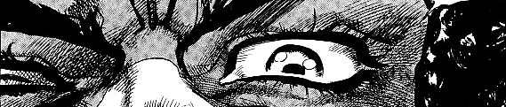
Panel Focus/Expression
We’ve previously looked at how Toriyama communicates his narrative with great clarity. There are a bunch of ways Araki ramps up intensity in JJBA, but since this post is getting terrifyingly long, for now I’ll just cover the way the two artists frame their characters.
Here are all the faces that Goku makes in chapter 159 the same size they appear in relation to each other.

And here’s every face Jotaro makes in chapter 262 at the same size they appear in relation to each other.

Nearly every shot of Goku shows his entire body, while Jotaro’s face takes up a significant amount of panel real estate. Because Goku is drawn in a very cartoony style, his expressions are easy to parse but limited in nuance, while Jotaro is drawn in a style that’s much closer to realism, meaning he has a wider range of subtle emotions but they require more attention from the reader to be read correctly. Clearly in Dragonball the focus is more on what the character is literally doing, while the focus in JJBA is more on how the character is feeling.
In light of this, if in a scene Goku and Jotaro are both equally angry, Goku HAS to be much more obviously angry than Jotaro does – in Jojo’s Bizarre Adventure, we understand that we’re in a world where actions have real consequences, so we can trust that when Dio hurts his friends, Jotaro is really upset under his cool demeanor. We can’t trust that a character in Dragonball has any deeper emotion than the one that’s obviously on their face. On the flip side, if Araki exaggerates characters’ expressions too much then he runs the risk of losing their grounding in reality and making them look emotionally unstable (sometimes he does this on purpose.)
Things are a little more ho-hum in Dragonball world.

If this woman were in JJJBA, she’d be monstrously grotesque. In Dragonball she’s just a humorously unattractive lady.


In JJBA this is the insane laughter of a disturbed vampire. In Dragonball world, it’s just a Super Saiyan bargain sale.
Bad Seafood: “I’m actually glad you addressed this, since back when I was reading your art of Dragon Ball posts the first comic I pulled off my shelf to compare was Jojo…which didn’t exactly hold up well to the silhouette experiment. I wondered at that time, but didn’t ask, about your opinion of Araki’s art. I’m pleased to see he gets a good grade, albeit for different reasons.”
Yep, you picked one of the exceptions that prove the rule. Jojo’s intensity is really hard to do well. What I’ve noticed with a lot of amateur artists (like the kids I knew in art classes in high school…including myself) and some professional artists (people on B and C-list DC/Marvel titles, I’m looking at you) is that they read a comic like Jojo and are blown away by what an incredible experience it is and try to bottle that magic in their own comics. What they end up doing is taking their comic and then splattering on a bunch of panel breaks, speed lines, close up shots of faces, long vertical panels, and so on because they feel like that’s just what you’re supposed to do rather than realizing the specific application of each of those techniques. Each one of those techniques reduces the clarity of the comic. If all these art intensifiers aren’t also intensifying the narrative itself, then you wind up with a huge mess.
I’d call it cargo-cult comicbooking. To use a more narrative-focused example, historically you can look back at how everything went grimdark in the 90s, and a lot of that goes back to people being exhilarated by The Dark Knight Returns and Watchmen and wanting to recreate that incredible feeling they had when reading those stories for the first time. Then suddenly pouches and tiny feet out the yin-yang.
Bad Seafood: “Something else I’m glad you’ve touched on is Jotaro. A lot of people like to complain about his stoic personality, some even saying he has no personality, but I’ve always felt he just never wore much of it on his sleeve. He’s cool-headed and composed, sure, but you can find little hints as to who he is underneath if you read closely enough – and Part 3 is perhaps my most reread part, so I’ve certainly had time to get to know him closely. When I learned Araki’s inspiration for Jotaro was Clint Eastwood, it made perfect sense.”
In a way I can’t blame people. In most shonen, what you see is what you get, and trying to read anything deeper than a surface reading is really barking up the wrong tree and maybe trying too hard to justify liking a kid’s show. One of the most annoying aspects of most shonen is that even though most characters’ designs are simple enough that their facial expressions are unmistakable, characters are usually always narrating exactly how they feel, so readers are basically trained to not make any inferences about any main characters’ inner life. With Jojo you have to approach it like a live-action film, a Clint Eastwood movie, perhaps? (haw) People are used to not having their hand held and being asked to make some inferences when watching a movie, my only guess is that it’s the medium and genre throwing everybody off.
Million Ghosts: “That was actually more interesting than your DB posts, keep doing God’s (DIO’s) work.”
What’s next:
Extreme violence vs. tight choreography, hyperreal vs. fantasy, panel layout, and transitions.

Great work, found this one really interesting too, specially the part about JJBA having to draw bigger faces since the reader needs to spend more time reading the characters’ faces.
LikeLike
Very interesting article. I never thought of the differences between “world without severe consequences and one without them” that changes the audience’s expectations and how explicit or implicit their feelings or actions should be.
I’ve only seen Jojo’s anime (which is an anime you actually enjoy more hearing than seeing fully animated, but I think it works in that case because of embracing direction and it’s still a lot of fun to watch), but from what I’ve seen from the manga it flows very well and it manages to capture such intensity. If I had to take a manga where it’s very stilish but isn’t an easy read, I’d say Trigun. There’s a lot of effort in the drawing of cool poses and movement, but the movement doesn’t flow well between different panels, and the author is not skillful at putting characters into backgrounds and differentating between them at a first sight, so it’s a manga that you should read fast but because of the confusing drawing you have to stare the panels too much time, and it ends up being a little exhausting. Which is a pity because many pros of the author’s drawing are hard to appreciate because of it.
LikeLike
I really love your review, but I got introduced to this through a very strange way.
These two videos have the exact same content and points that you made here. Even some of the lines are the same. Are you plagiarizing or being plagiarized?
LikeLike
this is all original by me. dang, thanks for bringing it to my attention
LikeLike